Reflecting back on my class, Digital File Preparation, I am proud of the work I produced. In this class you learn how to properly package and send an InDesign file for print. Coming into this class, I have already learned everything that was stated in the syllabus. Knowing that, I took the class regardless hoping I would learn it from a different perspective. This is what I learned, new, from PSU: To use tiff and eps over psd. How to properly use paths in Photoshop. Patience is a virtue! and that my classmates are very creative and inspiring. Their final projects gave me ideas I can use in the future.
What I would change: I would do away with the master image list. I would still have the students complete everything on it though. Knowing how to do each of the tasks on the list is important. For each project I would show them one or two of the techniques and have it required on that assignment. Its very important everyone leaves with a bag of tricks to impress their future clients.
Overall I am satisfied with the outcome of the class. I think it is great we, as students, have to interact with Printing and Design Services to get the real life feel to produce a product. That right there is really important for the Graphics field. Just being comfortable interacting with clients and printers.
Tuesday, December 13, 2011

Kanza Brewing Company


Even though Kanza Brewing Company is a pseudo micro brewing company, I wanted to make a professional grade corporate identity for my final project. I also took on such a workload so I could enter this identity into the Addys. I really enjoyed working on this project because it is a style I am very comfortable with and aspire towards. The micro brew culture is also fascinating to me! Its really exciting to produce art for it.


For KBC's identity I created the logo, package, bottle labels, bottle caps, and posters. (I hope to have coasters and t-shirts ready for the Addys)
I had a pretty good idea and just dove right into it on Illustrator. For my package, I tore a couple of old 4 packs apart and drew up my own template on Illustrator. Following that, I printed it out and folded up a dummy to make sure it would be the right size and that I had all the necessary folds, scores, and cuts.

My design was inspired by, Great Divide Brewing in CO, Odells Brewing, and Michael Schwab.
Once I got my package design finished, the label followed suit.

To wrap it all up, I made the posters.
Prices to get this produced.
the Carrier: $1.05/carrier for 5,000. total $5,250
the Labels: $0.18/label for 5,000. total $884.51
the Posters: $197 for 1,000


Tuesday, November 22, 2011
Magazine Ad
My magazine ad would be in Guitar World.
The only thumbnail I made up was my rough. When designing this ad I knew what I wanted and the overall layout. My target audience is all the rockers that read Guitar World Magazine. The call to action is the Microsoft Tag, which takes you the Soulicit's web page. On that webpage you will find another photos at the headers that is very similar to this ad! A full page ad for this magazine, full color, would cost $12,060 for one issue! My bleed is .125" all around.
Below is the rough i went off of Roughs

Below is the Final

Photo from Studio G Photography. Icons and Texture from Wegraphics.com. Soulicit logo, Thermal Entertainment logo from Soulicit LLC.
The only thumbnail I made up was my rough. When designing this ad I knew what I wanted and the overall layout. My target audience is all the rockers that read Guitar World Magazine. The call to action is the Microsoft Tag, which takes you the Soulicit's web page. On that webpage you will find another photos at the headers that is very similar to this ad! A full page ad for this magazine, full color, would cost $12,060 for one issue! My bleed is .125" all around.
Below is the rough i went off of Roughs

Below is the Final

Tuesday, November 1, 2011
Newspaper Ad
For my newpaper ad, I decided to make a fake ad for the Pitt State Automotive department.
Size: 5 columns by 6.5 inches.
Cost: $130
Audience: Prospective automotive students
Call to action: url and phone number
Bitmapped image: Signature
Tumbnails

Rough

Final ad

Size: 5 columns by 6.5 inches.
Cost: $130
Audience: Prospective automotive students
Call to action: url and phone number
Bitmapped image: Signature
Tumbnails

Rough

Final ad


Variable Data Postcard
For our variable data project, I chose to make a promotional postcard for an upcoming show. The variable data that changed depended upon the subjects favorite instrument. If they like guitar, they receive a postcard with the guitarist on it. If they like drums, they receive a postcard with the drummer on it. The recipient also has the chance to meet with that person at the show. I used a font that was easy to read since all the text I had was a paragraph. The color box, PMS 5395, I used on the back was based off the colors that are in the photographs. My call to action was inviting them to the show and my target audience was people interested in music. All photos came from Studio G Photography. Below are the postcard fronts and back.


Tuesday, October 25, 2011
to create is human, to steal is design.
Over fall break I kept my eyes open for design I liked or see daily. Some design I don't think twice about since I see it so often, but I realize I like. A few of these I got offline from link Adobe InDesign shared. Enjoy!
To start here are the ones I see so often I forget to think of them as design.


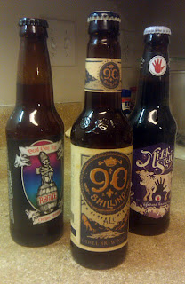


To start here are the ones I see so often I forget to think of them as design.


Next is what I see as I walk in between class or on break at work.


To finish are the ones I truly admire.


Thursday, September 22, 2011
QR Codes

What is a QR code? A QR code (Quick Response) is a matrix barcode. Marketers utilize this code to give potential customers/clients a quick and instant way to view their website, product, or whatever the business wants them to see. It is scannable by using a smartphone.
Subscribe to:
Posts (Atom)